23
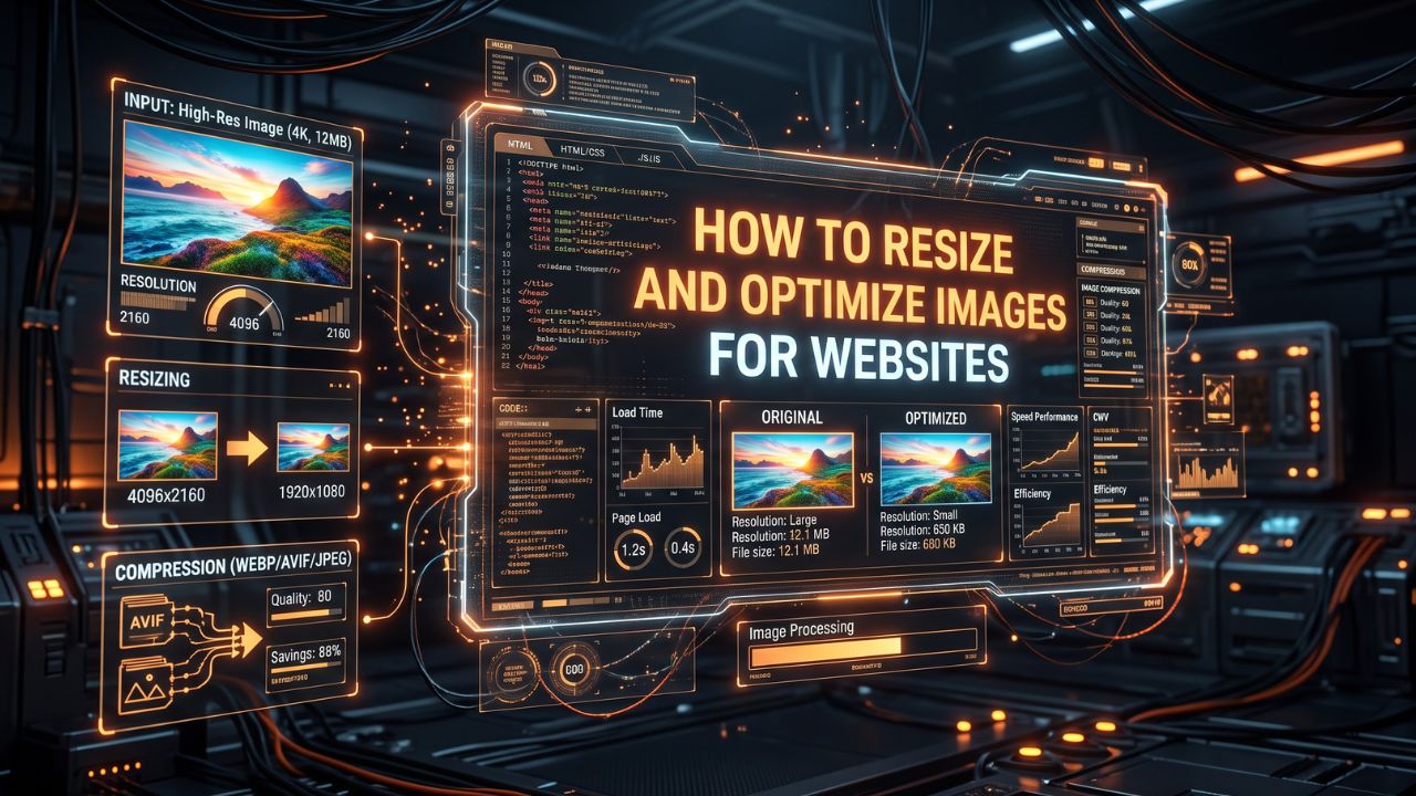
How to Resize and Optimize Images for Websites
Learn the best practices for resizing and optimizing images to improve your website's performance and user experience.
The Importance of Image Optimization for Web Performance
In today's fast-paced digital world, website speed is more critical than ever. When a user visits your website, they expect it to load almost instantly. One of the biggest culprits of slow-loading web pages is unoptimized images. Large, heavy image files can significantly bog down your site, leading to higher bounce rates and lower search engine rankings. This is why learning how to resize and optimize images is an essential skill for any web developer, designer, or content creator.
Image optimization involves reducing the file size of your images as much as possible without sacrificing quality. This process ensures that your images look great on all devices while maintaining blazing-fast page load speeds. By optimizing your visual content, you not only improve user experience but also boost your SEO efforts, as search engines like Google use page speed as a ranking factor.
Understanding Image Resizing vs. Image Compression
Before diving into the techniques of image optimization, it is important to understand the difference between resizing and compressing images. While both actions reduce file size, they do so in entirely different ways.
Image Resizing: This refers to changing the physical dimensions (width and height) of an image. For instance, if you take a photo with a digital camera, it might have a resolution of 4000x3000 pixels. If you only need it to appear as a 400x300 pixel thumbnail on your website, resizing the image to those specific dimensions will drastically reduce its file size.
Image Compression: Compression involves reducing the data footprint of an image without necessarily altering its dimensions. This is achieved by removing hidden data or slightly reducing the image quality in a way that is often imperceptible to the human eye. There are two main types of compression: lossless (which reduces file size without losing any quality) and lossy (which removes some data to achieve much smaller file sizes).
Best Practices for Resizing Images
Resizing images correctly is the first step toward optimization. Uploading massive images and relying on HTML or CSS to scale them down is a common mistake that negatively impacts page speed. The browser still has to download the full-sized image before shrinking it for display.
- Know Your Display Size: Always resize your images to the exact dimensions they will be displayed at on your website. If your blog's content area is 800 pixels wide, there is no need to upload an image that is 2000 pixels wide.
- Use the Right Tools: You do not need expensive software like Photoshop to resize images. Online tools can handle this quickly and efficiently. For instance, you can use our Image Resizer Tool to quickly adjust the dimensions of your photos to fit your website's layout perfectly.
- Consider Responsive Design: With users accessing websites on various devices, from desktop monitors to tiny smartphone screens, responsive images are crucial. Use the HTML
srcsetattribute to serve differently sized images based on the user's screen size, ensuring they only download what they need.
Cropping for Better Composition
Sometimes, resizing is not enough. You might have an image where the main subject is too small, or there is too much distracting background. In these cases, cropping the image is necessary. Cropping allows you to focus on the most important part of the image, improving its visual impact and often changing its aspect ratio to better fit your design.
When cropping, keep the "Rule of Thirds" in mind, placing your subject at the intersections of a 3x3 grid for a more balanced and engaging composition. If you need a quick and easy way to crop your photos before uploading them, check out our Image Cropper, which helps you frame your shots perfectly for web use.
Choosing the Right Image Format
Selecting the appropriate file format is a massive part of image optimization. The format you choose dictates the quality, features (like transparency), and overall file size of the image.
1. JPEG (Joint Photographic Experts Group)
JPEGs are the standard for photographs and images with complex colors and gradients. They use lossy compression, which means you can significantly reduce the file size by sacrificing a small amount of quality. Most image editing software allows you to adjust the compression level to find the sweet spot between file size and visual fidelity.
2. PNG (Portable Network Graphics)
PNGs are ideal for images that require transparency, such as logos, icons, and illustrations with sharp edges and solid colors. They use lossless compression, meaning the image quality remains perfect, but the file sizes are generally larger than JPEGs. If your image doesn't need a transparent background and has lots of colors, a JPEG is usually a better choice.
3. WebP
WebP is a modern image format developed by Google that provides superior lossless and lossy compression for web images. WebP images are typically 25% to 34% smaller than comparable JPEGs and PNGs without sacrificing quality. Most modern web browsers support WebP, making it the highly recommended format for optimizing web performance today.
4. SVG (Scalable Vector Graphics)
SVGs are entirely different from raster images (like JPEGs and PNGs). They are vector-based, meaning they use math to define shapes and lines. SVGs are infinitely scalable without any loss of quality, making them perfect for logos, icons, and simple illustrations. Because they are code-based, SVG file sizes are often incredibly small.
Advanced Image Optimization Techniques
Once you have resized your images and chosen the correct format, there are a few more steps you can take to ensure maximum optimization.
- Remove Metadata: Digital cameras and smartphones embed hidden data into image files, such as camera settings, GPS coordinates, and copyright information. This EXIF data takes up unnecessary space. Removing it during the optimization process can shave off extra kilobytes.
- Implement Lazy Loading: Lazy loading is a technique that delays the loading of images that are not immediately visible on the user's screen. Instead of loading all images at once when the page opens, images are only downloaded as the user scrolls down. This drastically reduces initial page load times and saves bandwidth for both you and your visitors.
- Utilize Content Delivery Networks (CDNs): A CDN stores copies of your website's images on servers located all around the world. When a user visits your site, the images are served from the server closest to them, significantly reducing latency and speeding up delivery. Many CDNs also offer automated on-the-fly image optimization and formatting.
The SEO Benefits of Image Optimization
Optimizing your images doesn't just make your website faster; it also provides direct SEO benefits. Google considers page load speed a major ranking factor, particularly for mobile searches. Faster sites are prioritized in search results.
Furthermore, properly optimized images provide more context to search engines. By using descriptive filenames (e.g., "red-running-shoes.jpg" instead of "IMG_1234.jpg") and accurately describing the image in the ALT text, you improve your chances of appearing in Google Image Search, driving additional organic traffic to your site.
In conclusion, taking the time to resize, crop, format, and compress your images is a small effort that yields massive returns for your website's user experience and search engine visibility. Start integrating these practices into your workflow today, and watch your site's performance soar.
Contact
Missing something?
Feel free to request missing tools or give some feedback using our contact form.
Contact Us